Focus Theme Documentation
Requirements
Please ensure that you have a HubSpot account to use this theme. If not, you can visit this link to create a HubSpot account.
Installation
You can either install your theme from HubSpot Asset Marketplace or a .zip file.
From HubSpot Asset Marketplace
If you're installing the theme from HubSpot Asset Marketplace, just click the Install for free button on theme page and then follow the instructions.
From .zip file
If you have a .zip file of your HubSpot CMS theme, please follow the steps below to install it onto your account:
- Login to your HubSpot account.
- On the top right, click the Settings icon (looks like a gear).
- Click Tools > Website > Themes from the left sidebar menu.
- You'll see the Upload Theme button at the top right corner of the screen. Click it and then choose the zip file you've got.
If you completed the steps successfully, you should see the Focus theme and its templates when you're creating a new page.
To learn more about theme installation, please visit HubSpot Reference Docs.
FAQ
Here you can find the answers to frequently asked questions by our customers.
How can I view "Theme Options"?
Navigate to Marketing > Website > Website Pages and choose a page to edit. On Edit page screen, switch to Theme tab and then click Edit theme settings button.
How can I remove the "\" icon under titles?
Go to Theme Options > Other settings > Visual tweaks and uncheck Show slash icon under titles box.
How can I import Focus colors to my HubSpot account?
You can use the following URL to import the colors we used in our Focus theme:
https://www.stuff-n-matters.com/focus-colors
To do this, go to Settings > Account Defaults page in your HubSpot account and switch to Branding tab. Click Colors now and then Import colors from URL button.
Templates
Focus has 9 ready-to-use page templates for you, as well as the default HubSpot system templates such as Search Results, Password Required Page, Subscription Page etc.
Home
This template has been designed to be used on the homepage of your website. It contains the following sections and modules in order:
- Hero slider
- 3 column text with image
- 1-3 column text
- Number counters (Module)
- Events
- Quote
- 3 column text
- Call-to-action
File location: /templates/home.html
About
When you need to provide some information about you and your team, you can use this template. It contains the following sections and modules in order:
- Page title
- 2 column text
- Team
- Tabs (Module)
- Media boxes (Module)
File location: /templates/about.html
Services
You can provide information about what you do, your services and clients, customer reviews and pricing with this template. It contains the following sections and modules in order:
- Page title
- Cards (Module)
- Testimonials
- Clients (Module)
- Pricing
- Call-to-action
File location: /templates/services.html
Contact
You can use this template to create your contact page. It contains the following sections in order:
- Page title
- Contact info
- Questions and answers
File location: /templates/contact.html
Blog Index
This is the template for your blog. It contains the following module:
- Blog listings (Module)
File location: /templates/blog-index.html
Blog Post
For now, HubSpot does not allow to use drag & drop features in blog post templates. So, sections and modules are embedded into the template and you can't access them via the page editor.
File location: /templates/blog-post.html
Landing Page
This is a general landing page template to collect some information about your visitors via a form and reply a couple of frequently asked questions. It contains the following sections in order:
- Page title
- Quote and form
- Questions and answers
File location: /templates/landing-page.html
Landing Page - Coming Soon
If your website is under construction, you can welcome your visitors with this template. It contains the following sections and modules in order:
- Page title
- Countdown timer (Module)
- Form with title and text
File location: /templates/landing-page-coming-soon.html
Landing Page - Thank You
When visitors submit a form on your website, you can redirect them to a page which has been created with this template. It contains the following sections and modules in order:
- Page title
- Rich text (Native HubSpot module)
- Button (Native HubSpot module)
File location: /templates/landing-page-thank-you.html
Sections
Focus has 16 ready-to-use sections.
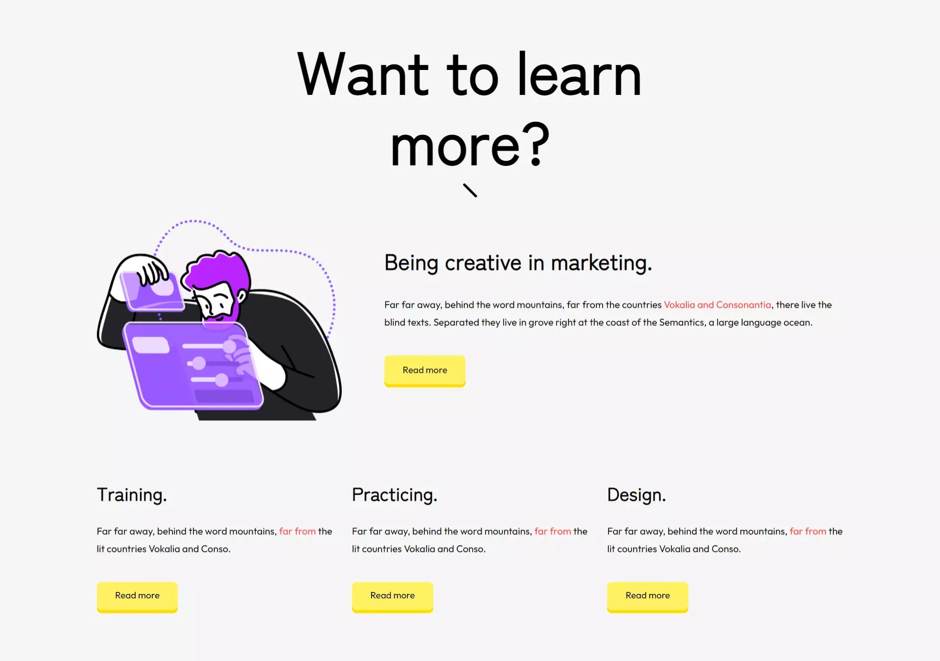
1-3 column text
One fullwidth column with content and 3 more columns below it.
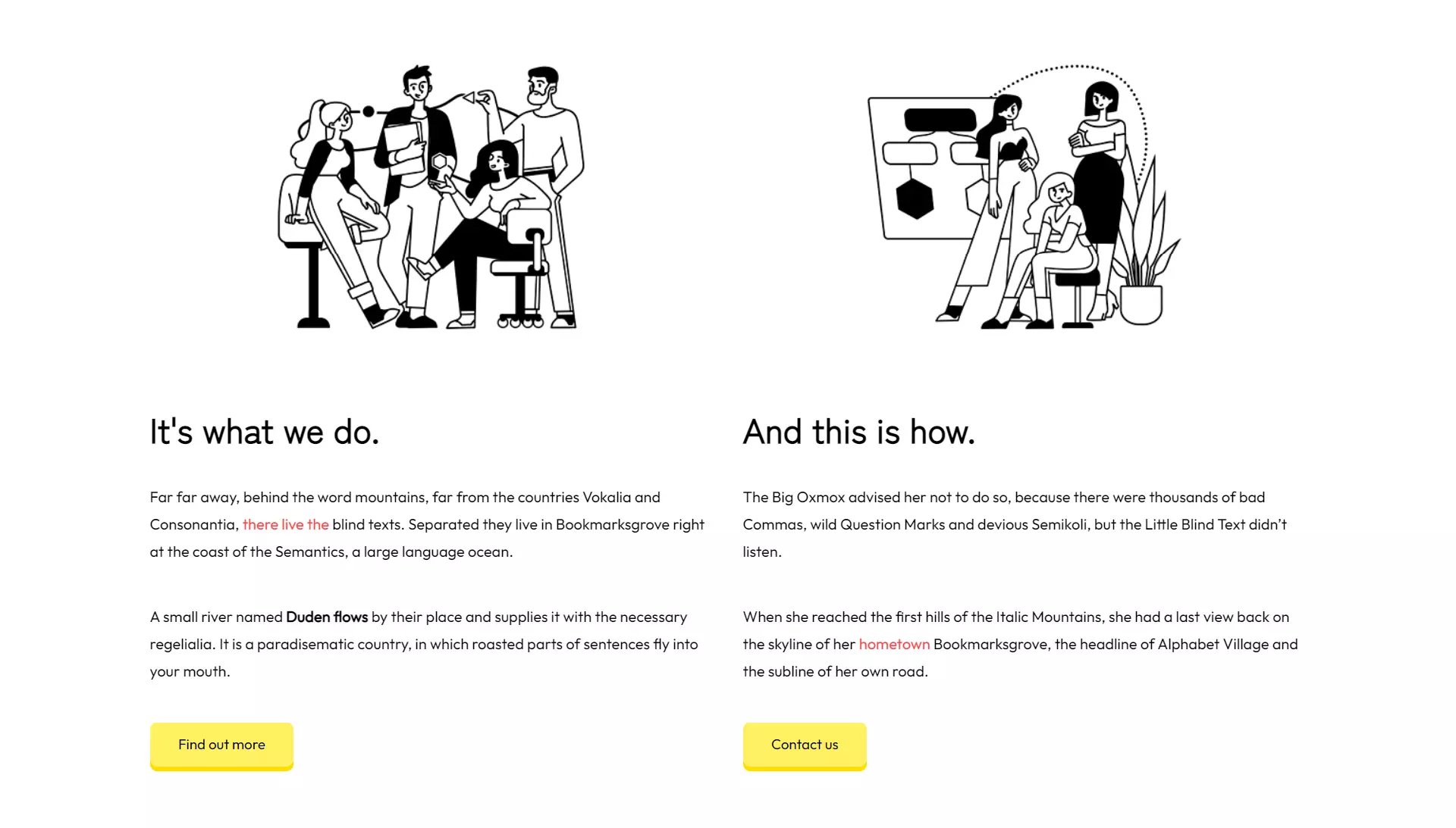
2 column text
2 columns of text, image and button.
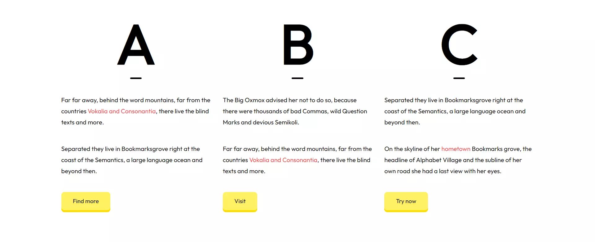
3 column text
3 columns of texts with big capital letters/numbers above them.
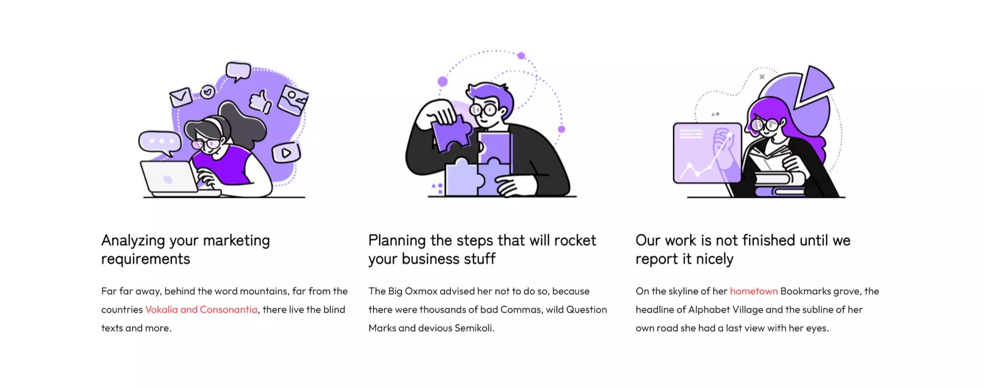
3 column text with image
3 columns of text content with image.
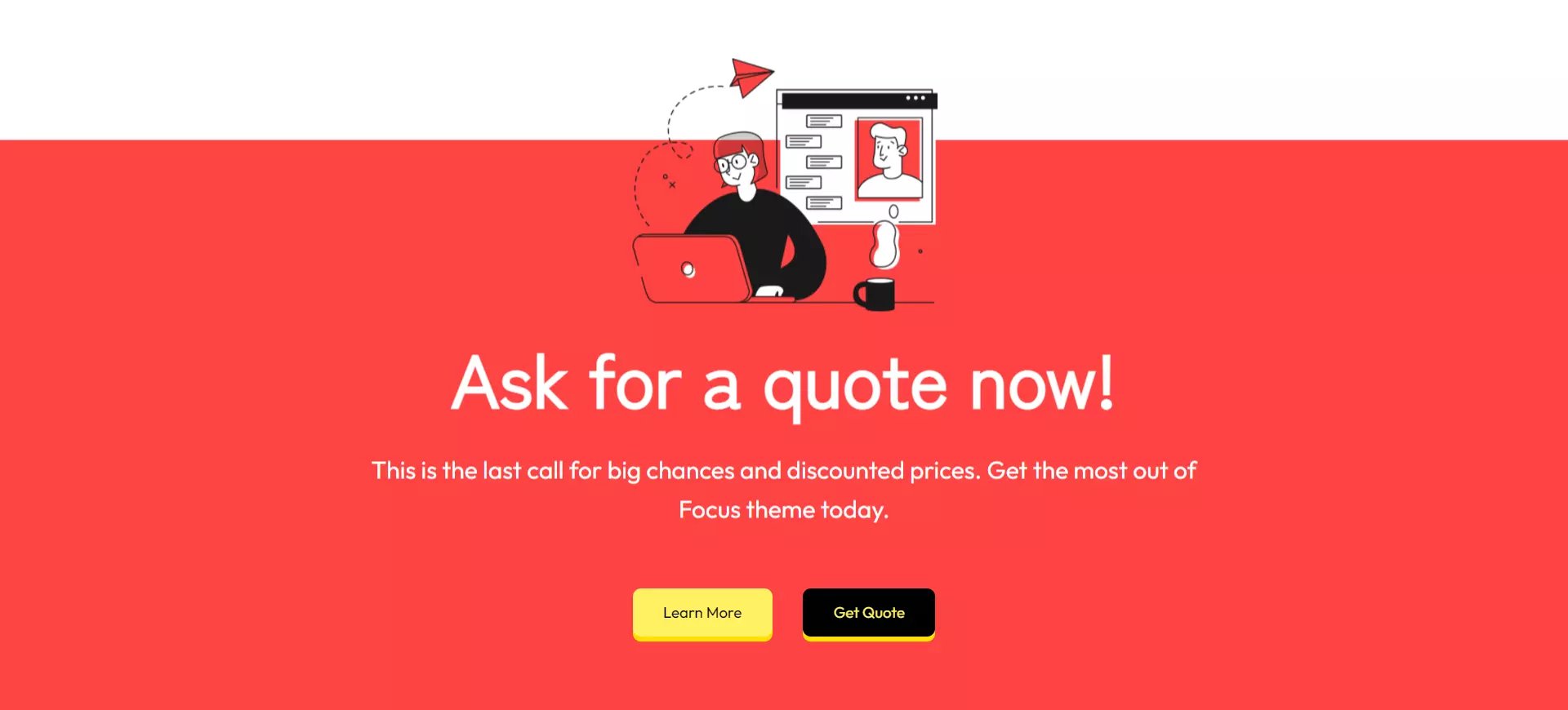
Call-to-action
A fullwidth call-to-action section which includes the CTA section module.
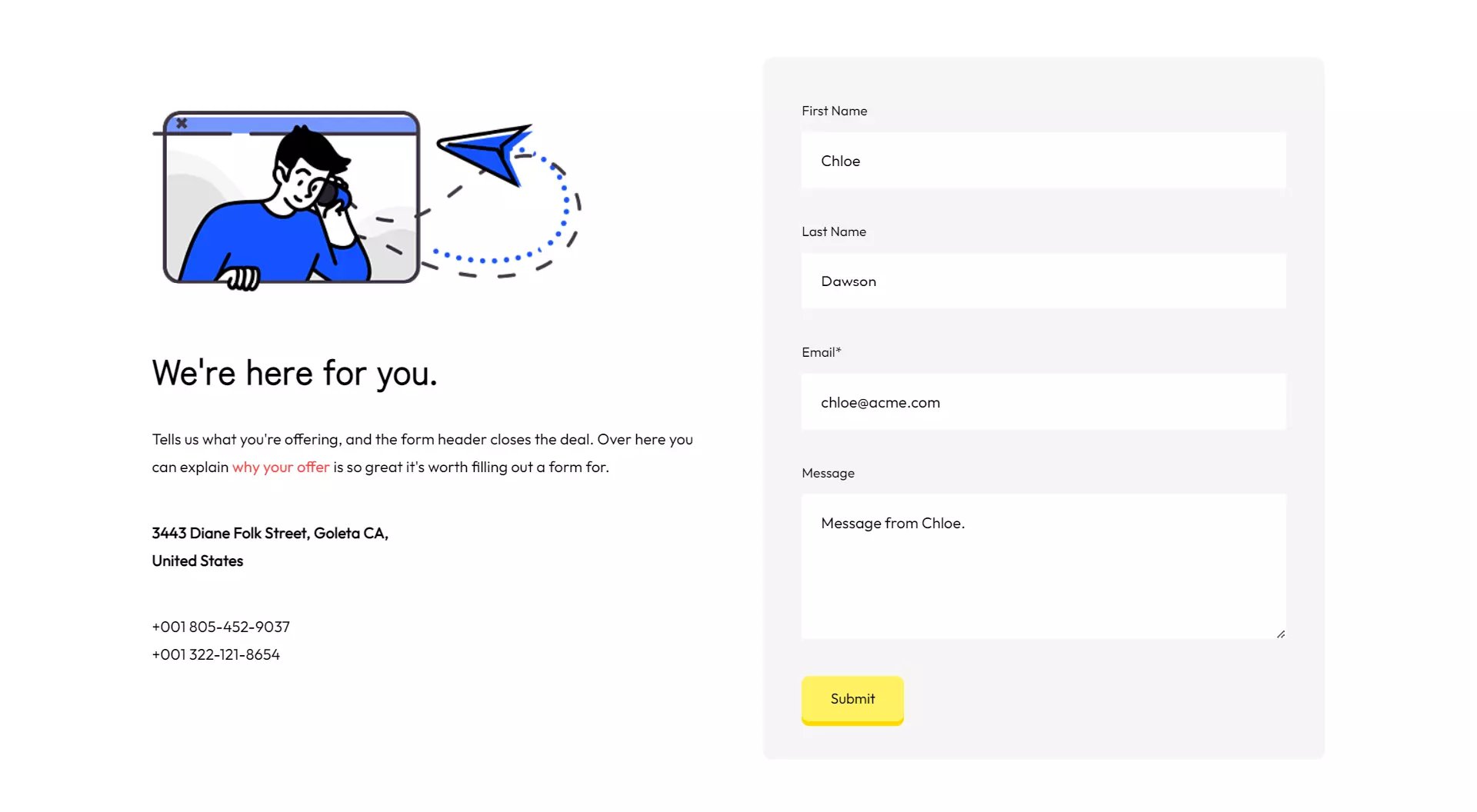
Contact info
An image, address information and a contact form.
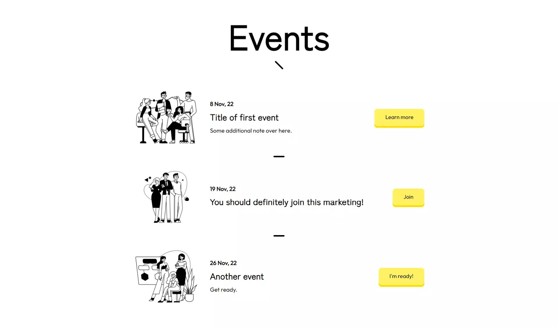
Events
An event list section with a title and Events module.
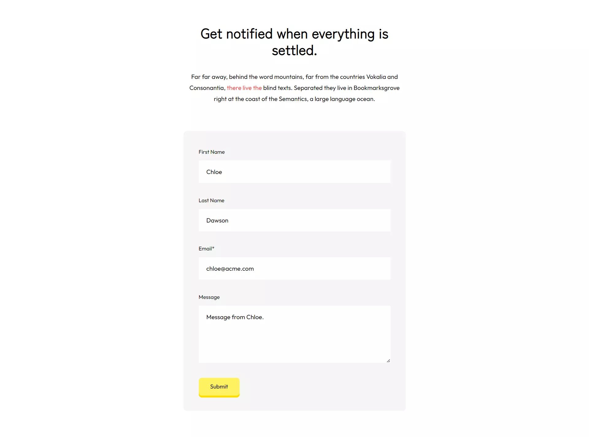
Form with title and text
A form with title and text above it.
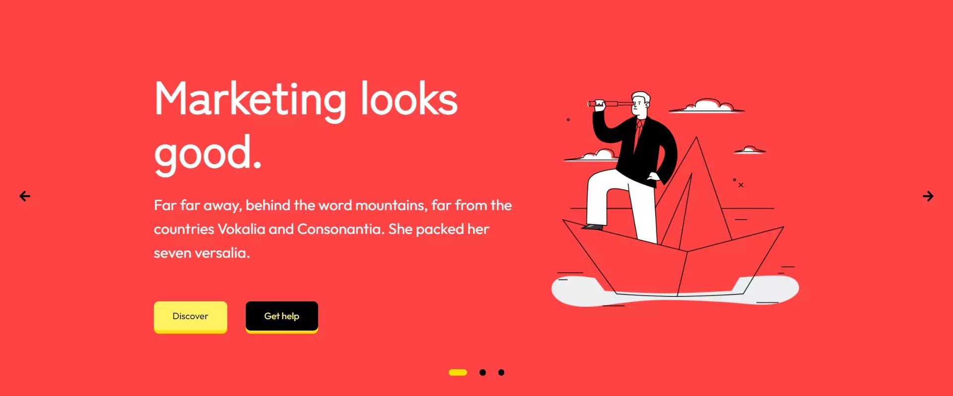
Hero slider
Fullwidth hero slider with 3 slides.
Page title
Page title section for placing at the top of pages.

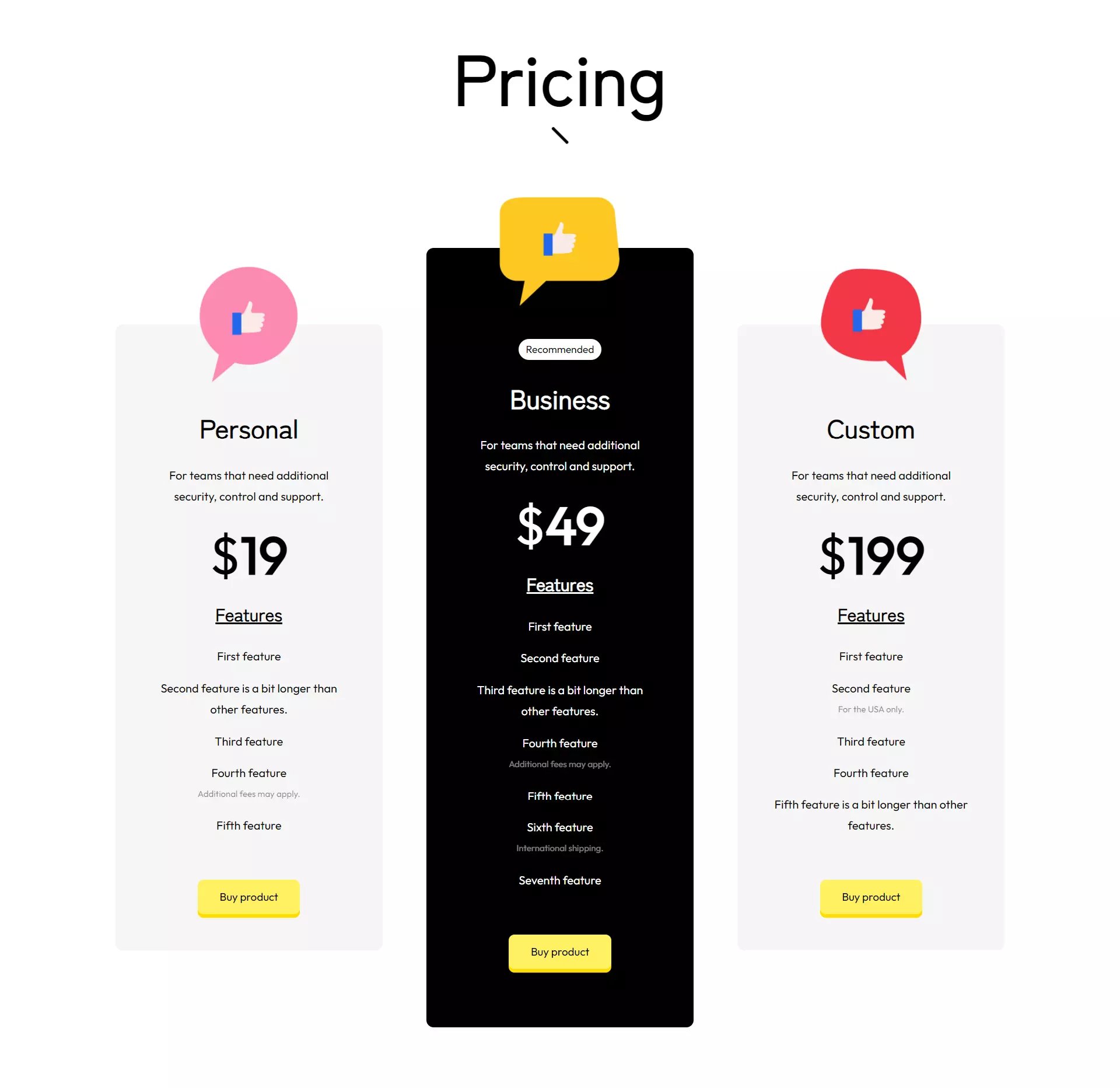
Pricing
Pricing cards for your plans.
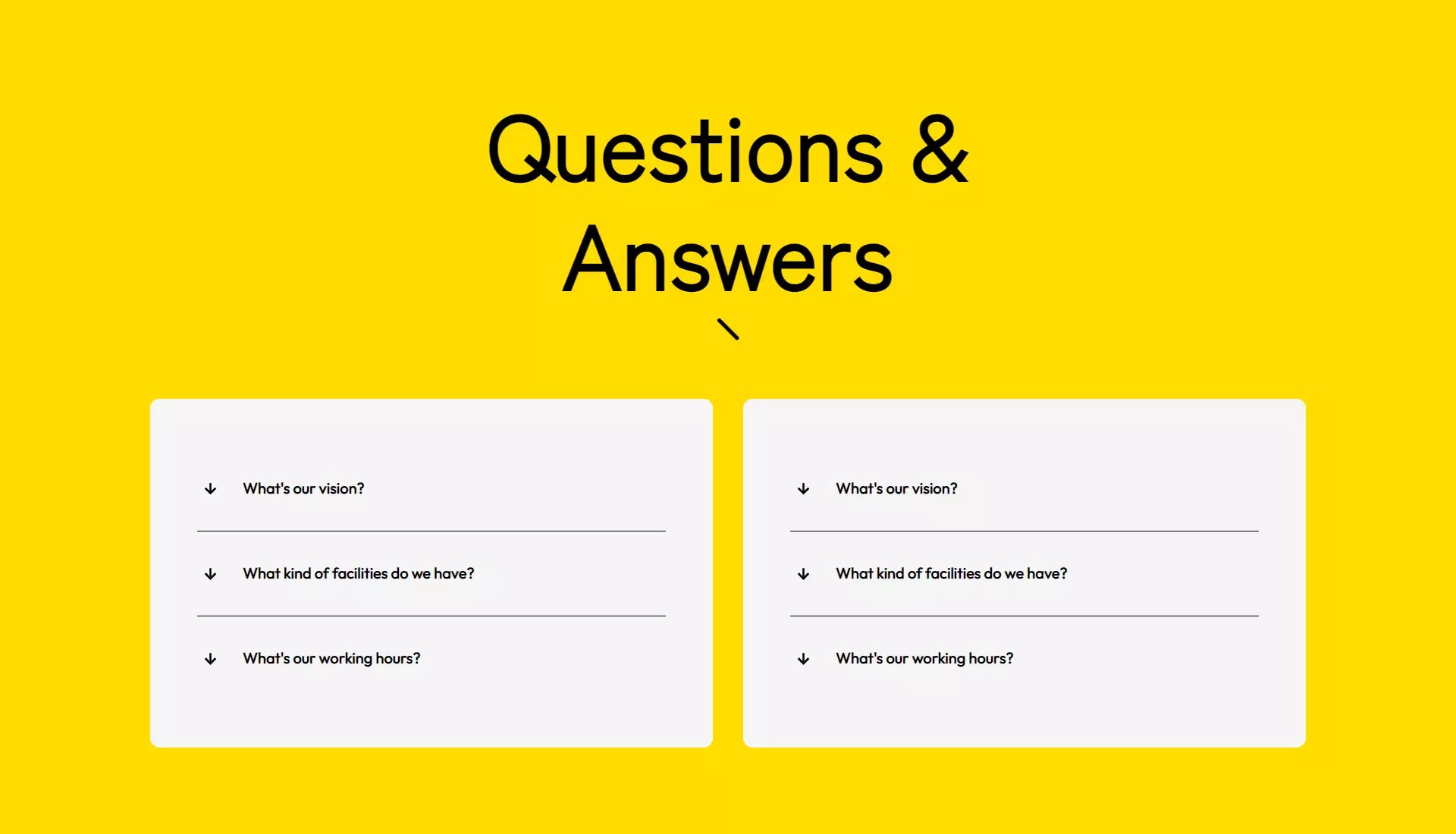
Questions & answers
Questions & answers (FAQ) section with accordions.
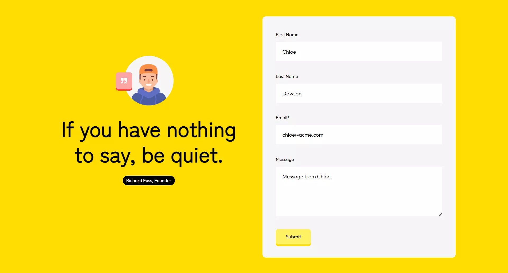
Quote and form
A quote module and a form next to it.
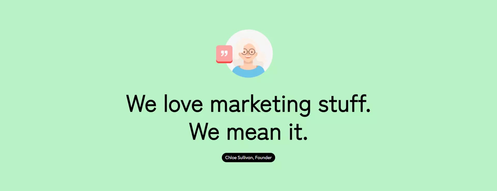
Quote
A quote section with the Quote module in it.
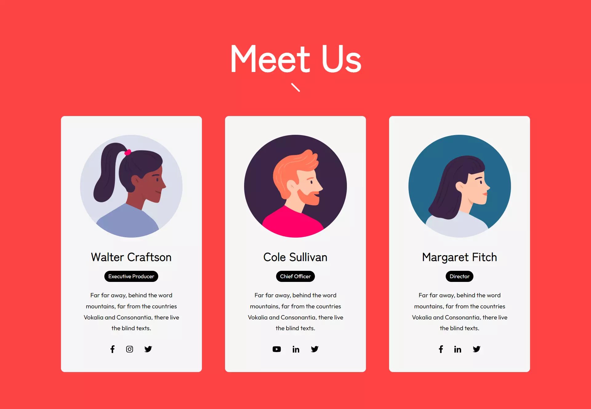
Team
A title and 3 person cards.
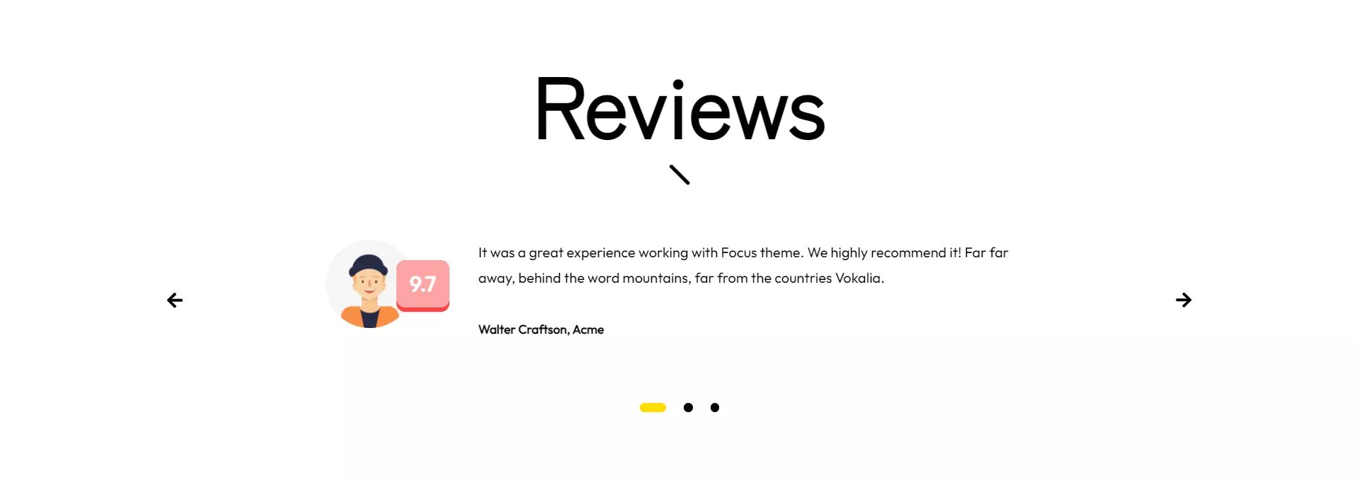
Testimonials
A section for your customer reviews.
Modules
Focus has 29 ready-to-use modules.
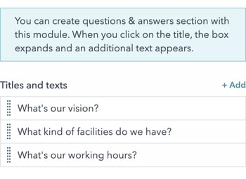
Accordion
You can create questions & answers section with this module. When you click on the title, the box expands and an additional text appears.
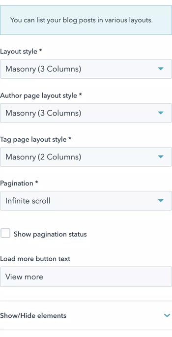
Blog listings
You can list your blog posts in various layouts.
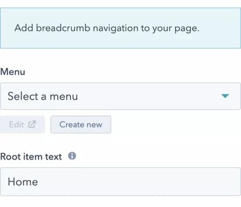
Breadcrumb
Add breadcrumb navigation to your page.
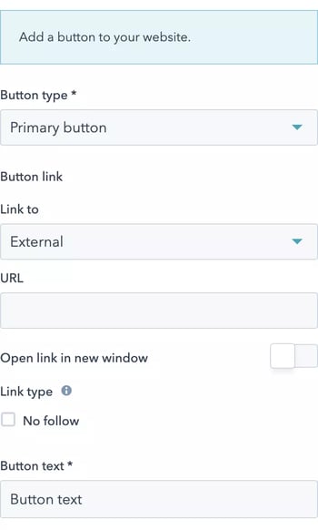
Button with link
Add a button to your website.
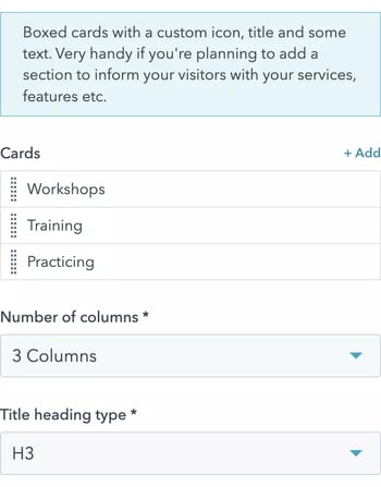
Cards
Boxed cards with a custom icon, title and some text. Very handy if you're planning to add a section to inform your visitors with your services, features etc.
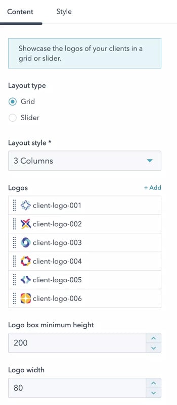
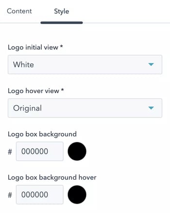
Clients
Showcase the logos of your clients in a grid or slider.
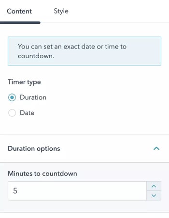
Countdown timer
You can set an exact date or time to countdown.
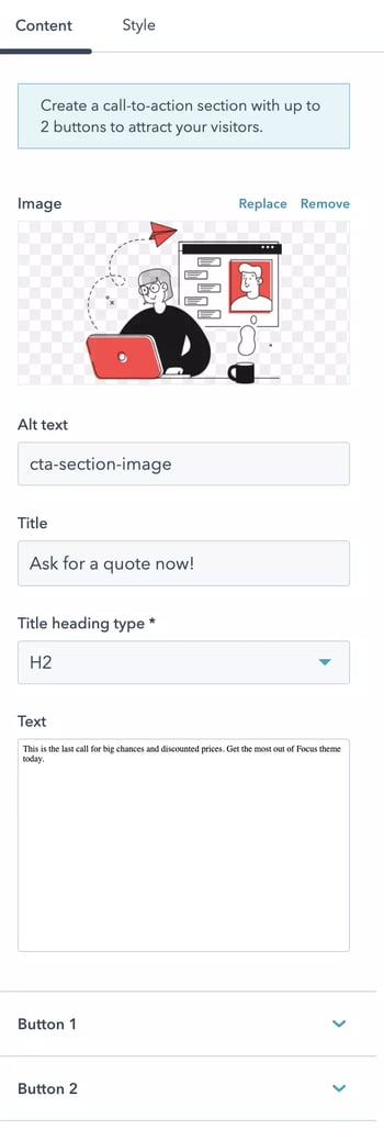
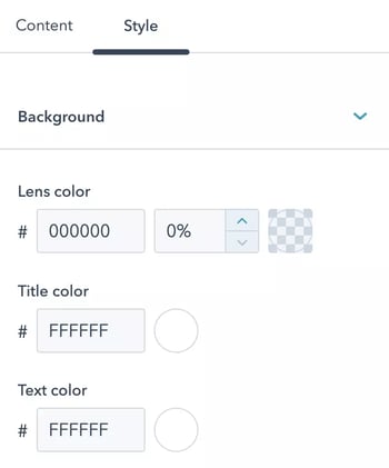
CTA section
Create a call-to-action section with up to 2 buttons to attract your visitors.
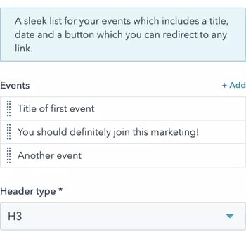
Events
A sleek list for your events which includes a title, date and a button which you can redirect to any link.
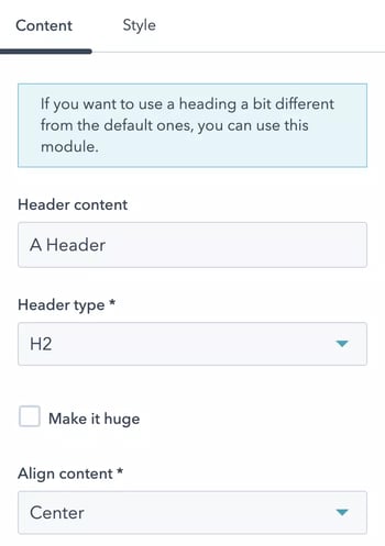
Fancy header
If you want to use a heading a bit different from the default ones, you can use this module.
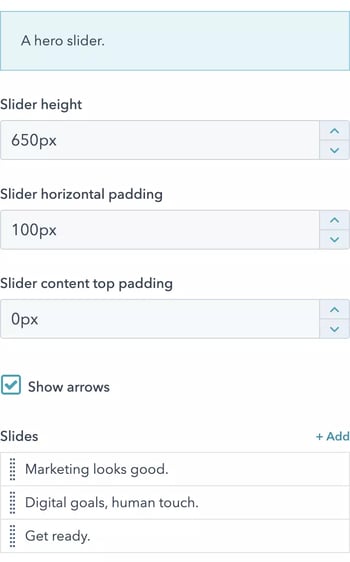
Hero slider
A hero slider.
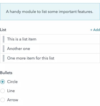
List
A handy module to list some important features.
Map
Add a Google Map to your website.

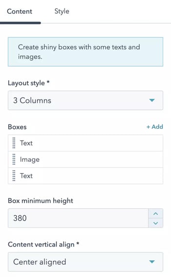
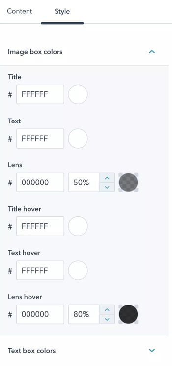
Media boxes
Create shiny boxes with some texts and images.
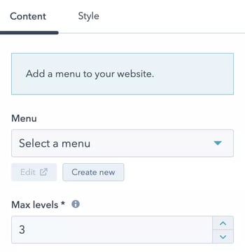
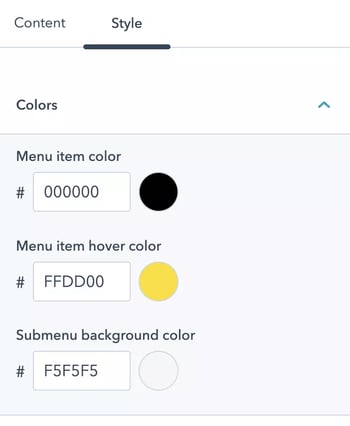
Menu
Add a menu to your website.
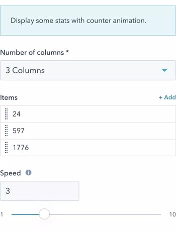
Number counters
Display some stats with counter animation.
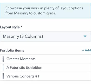
Portfolio
Showcase your work in plenty of layout options from Masonry to custom grids.
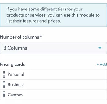
Pricing cards
If you have some different tiers for your products or services, you can use this module to list their features and prices.
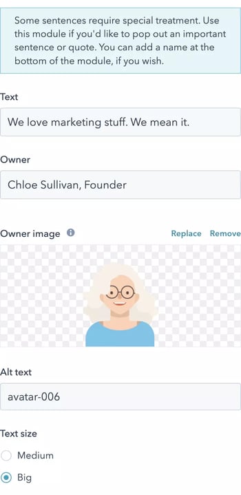
Quote
Some sentences require special treatment. Use this module if you'd like to pop out an important sentence or quote. You can add a name at the bottom of the module, if you wish.
SEO schema
Add schema.org to your website.
Single letter/number
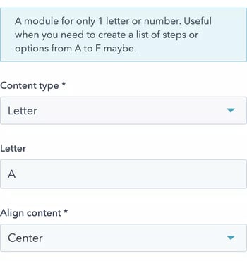
A module for only 1 letter or number. Useful when you need to create a list of steps or options from A to F maybe.
Social accounts
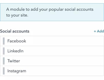
A module to add your popular social accounts to your site.
Tabs
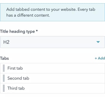
Add tabbed content to your website. Every tab has a different content.
Team members
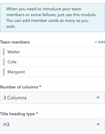
When you need to introduce your team members or some fellows, just use this module. You can add member cards as many as you wish.
Testimonials
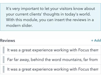
It's very important to let your visitors know about your current clients' thoughts in today's world. With this module, you can insert the reviews in a modern slider.
Text with image
A multipurpose text section with an optional image and button.

Vertical spacer
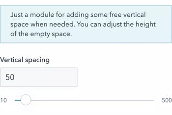
Just a module for adding some free vertical space when needed. You can adjust the height of the empty space.
Website footer
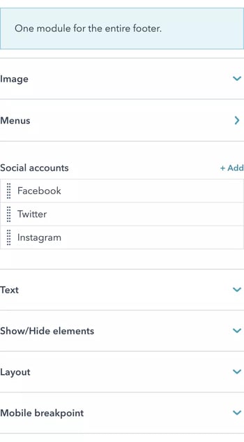
One module for the entire footer.
Website header
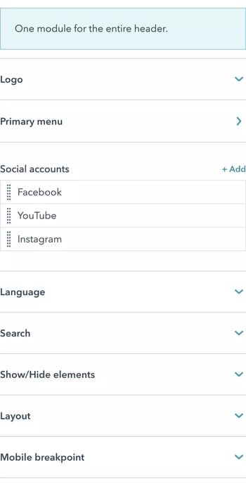
One module for the entire header.
Theme Options
To edit a theme setting, please go to Marketing > Files and Templates > Design Tools and select Focus theme from the left hand side. Then click Preview button.
There are a bunch of configurations that you can find in theme options. The complete structure is as follows:
- Global colors
- Primary color
- Secondary color
- Tertiary color
- Primary accent color
- Secondary accent color
- Header colors
- Menu
- Menu item
- Menu item hover
- Active menu item
- Submenu background
- Submenu item
- Submenu item hover
- Active submenu item
- Submenu item hover background
- Icons
- Icon
- Icon hover
- Overlay window
- Background
- Text
- Link
- Link hover
- Container
- Container background
- Mobile
- Container background
- Item color
- Item hover color
- Menu
- Body colors
- Background color
- Text color
- Heading color (H1 > H6)
- Link color
- Link hover color
- Footer colors
- Menus
- Menu title
- Menu item
- Menu item hover
- Social accounts
- Social icon
- Social icon hover
- Text
- Text color
- Container
- Container background
- Menus
- General view
- Borders
- Corners
- Typography
- Primary font
- Font
- Line height
- Letter spacing
- Secondary font
- Font
- Line height
- Letter spacing
- Body
- Font
- Font style (size)
- Spacing between paragraphs
- Links
- Link color
- Link hover color
- Headings (H1 > H6)
- Font
- Font style
- Primary font
- Buttons
- Primary buttons
- Text
- Font
- Font style
- Background
- Background color
- Border
- Corner
- Hover styles
- Text color
- Background color
- Border
- Disabled
- Text color
- Background color
- Text
- Primary buttons
- Forms
- Title
- Text color
- Background color
- Body
- Text color
- Background color
- Border
- Fields
- Text color
- Placeholder color
- Background color
- Border
- Labels
- Font style
- Title
- Spacing
- Section
- Desktop
- Vertical spacing between sections
- Mobile
- Vertical spacing between sections
- Desktop
- Content
- Maximum content width
- Section
- Other settings
- Visual tweaks
-
Show slash icon under titles
-
- Blog post
- Use infinite blog post
- Related posts limit
- Related posts column
- Visual tweaks
Keep in mind that you'll need to click the Publish to ... assets button at the top right corner of the screen only if you'd like to make changes on all pages that created with the theme.
Don't forget to click Apply Changes to let your changes take affect, when needed. You can visit HubSpot Knowledge Base for more information regarding your theme settings.